
Product
Web-based CRM platform used by investment teams to manage deals, notes, and structured information.
Target Audience
Investment analysts and managers working with large volumes of unstructured data and deal documentation.
My Role
I was responsible for restructuring the note-creation experience — from defining interaction logic and edge cases to designing adaptive states and AI-assisted workflows in close collaboration with product and engineering.
Redesigning the Note form
Old version
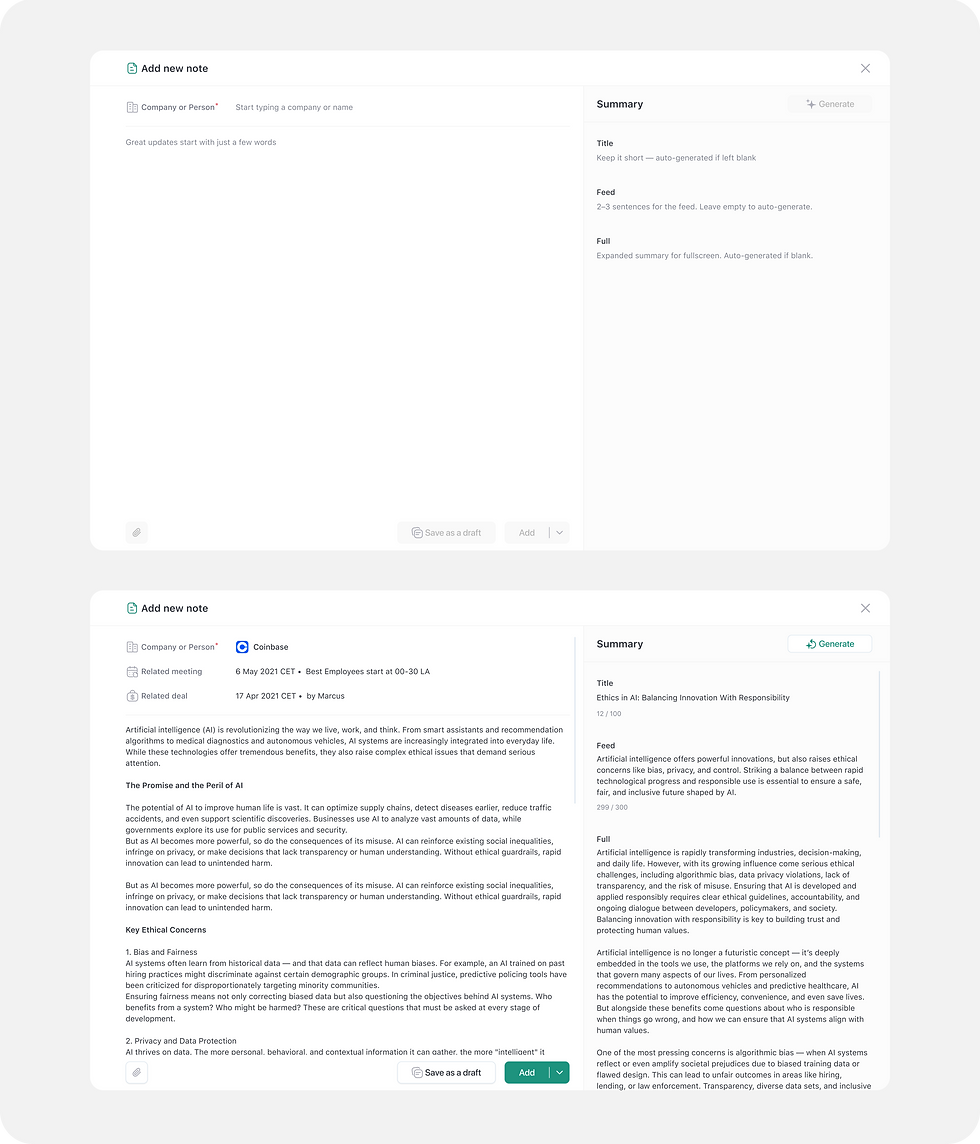
The original note form was structured and rigid: each section had labeled fields (e.g., Title, Note text), stacked vertically with strong visual borders. While functional, the layout felt heavy and static. Users struggled to focus, especially when all fields were filled — the form became visually dense and cognitively demanding. In the empty state, the form felt too technical and uninspiring, which discouraged initial input.

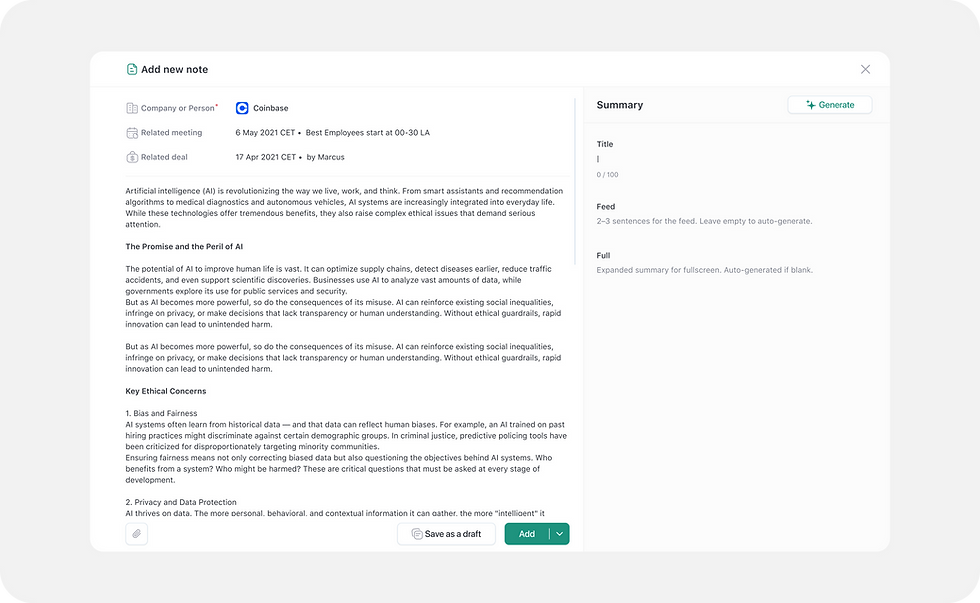
New version with Summary feature
The task was to make the note interface feel more like a document — something you’d like to write in. Inspired by tools like Notion and Linear, we aimed for a lightweight, inviting experience that could grow with the content without overwhelming the user. I focused on simplicity, flexibility, and intelligence, especially through AI integration.
AI integration
I mapped four core flows to ensure intuitive summary behavior:
The user fills in the note without previewing or editing the summary:
All fields remain empty → AI generates all summaries

The user manually fills in all summary fields without AI
The user manually fills in one or more summary fields:
Only empty fields are generated with AI→ Manual entries are skipped

Full AI Summary Generation for the preview and editing

Edge cases & states
Manual only: When offline, users can still write and save notes and summaries manually. The interface adapts by disabling the AI button and displaying a tooltip.

When the AI Summary was already generated but the user makes manual changes (e.g. edits fields or the main note content)

If something goes wrong during AI generation (e.g., network issue, timeout, API failure)

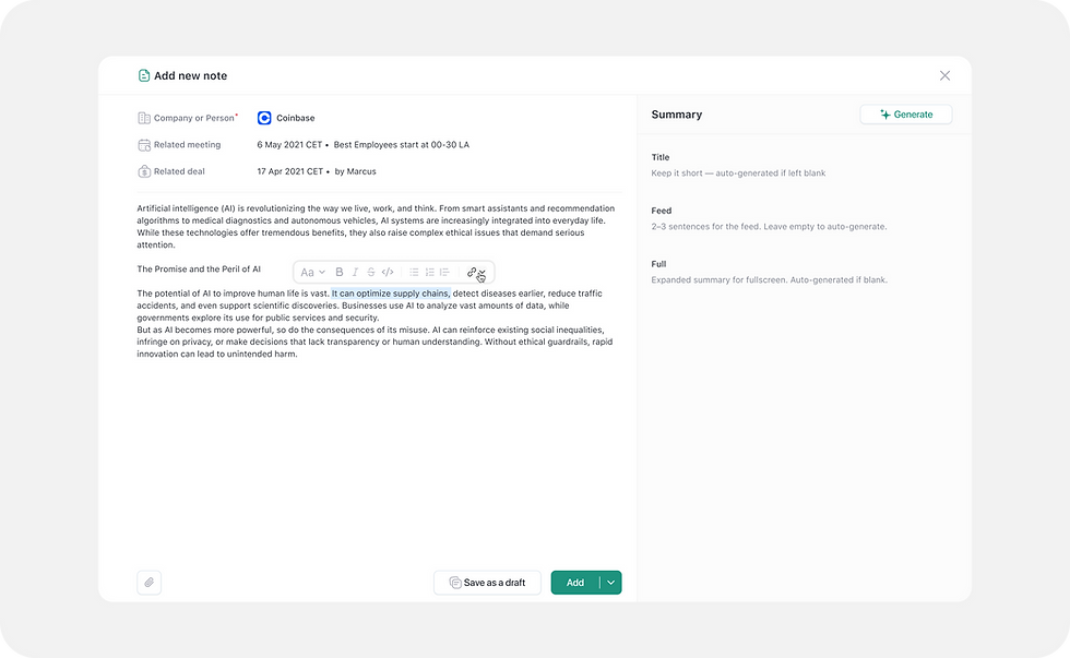
Rich Text Panel Redesign
-
Old UI: A standard text editor with minimal visual hierarchy and unclear states. Users often missed formatting options or didn’t notice when styles were applied.
-
New UI: Compact, clean layout with icon-only buttons and placement dynamically adjusts to cursor position and viewport size.
-
Consistent alignment with input fields and selection
-
Context-aware visibility: the toolbar appears only on focus or text selection
-
Clear active states (e.g., bold, italic) with accessible contrast
-
Document Loading State
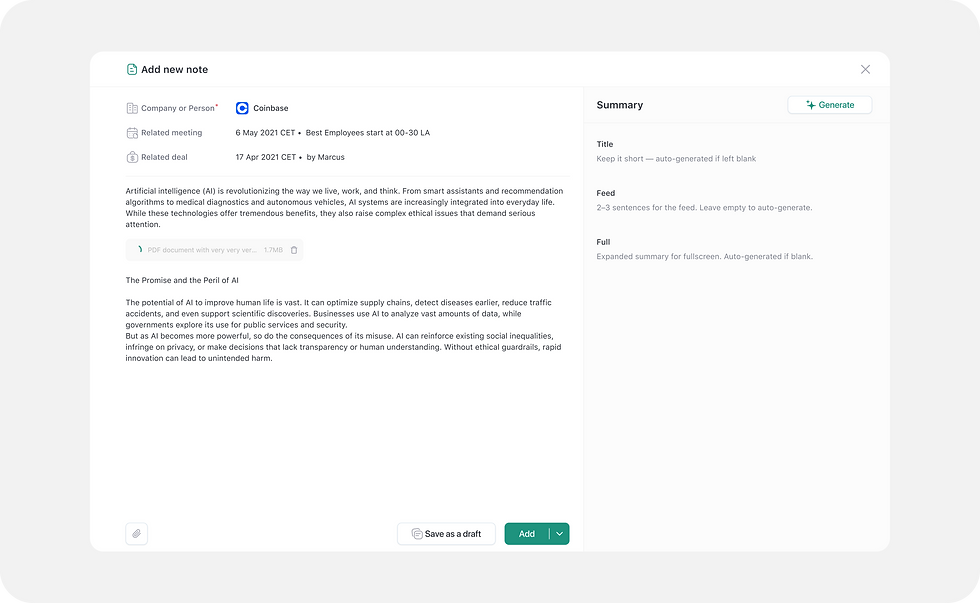
To improve the experience when opening a note, I redesigned how document loading is displayed — making it faster, less intrusive, and more informative.
-
Introduced inline loading directly in the note interface, instead of blocking overlays — allowing users to stay in context while content loads.
-
Users can start interacting with editable fields (like title or concerns) even before the document finishes loading.
Adaptive design
Adaptive design for 1024 & 500 px

Outcome
A fully responsive, modular note form that’s easier to read, quicker to use, and ready for AI-powered workflows.
-
Notion-like field appearance for lighter UI
-
UI improvements of existing functions
-
AI generation logic mapped to real-world cases
-
Adaptive design for 1440 / 1000 / 500 px
-
Smart suggestions and field-level feedback